The Tate Collection has released a tremendous amount of metadata about the artwork they collect and display. While my taste in art is pretty limited (I’m one of those horrible “I know what I like but not what it’s called” people), my taste in data is pretty expansive (by which I mean “I like having all of the data”). I thought I’d go through the release and see what I could build.
The metadata is divided into two datasets, both stored as groups of JSON objects, with one covering artists whose works are held by the Tate and the other covering the works themselves. My fork of the dataset (which contains both the graphs I generated and the code used to generate said graphs) can be found in this github repo. The code itself is a mess, because for one-off projects I tend to care more about what I make than how I make it, but it’s all functional (in both senses).
Art as gender
One of the great things about the Tate is that it has a lot of works - and a lot of works translates to a lot of artists (3,382, when removing those with missing data). This lets us play with demographic data, such as artist gender.
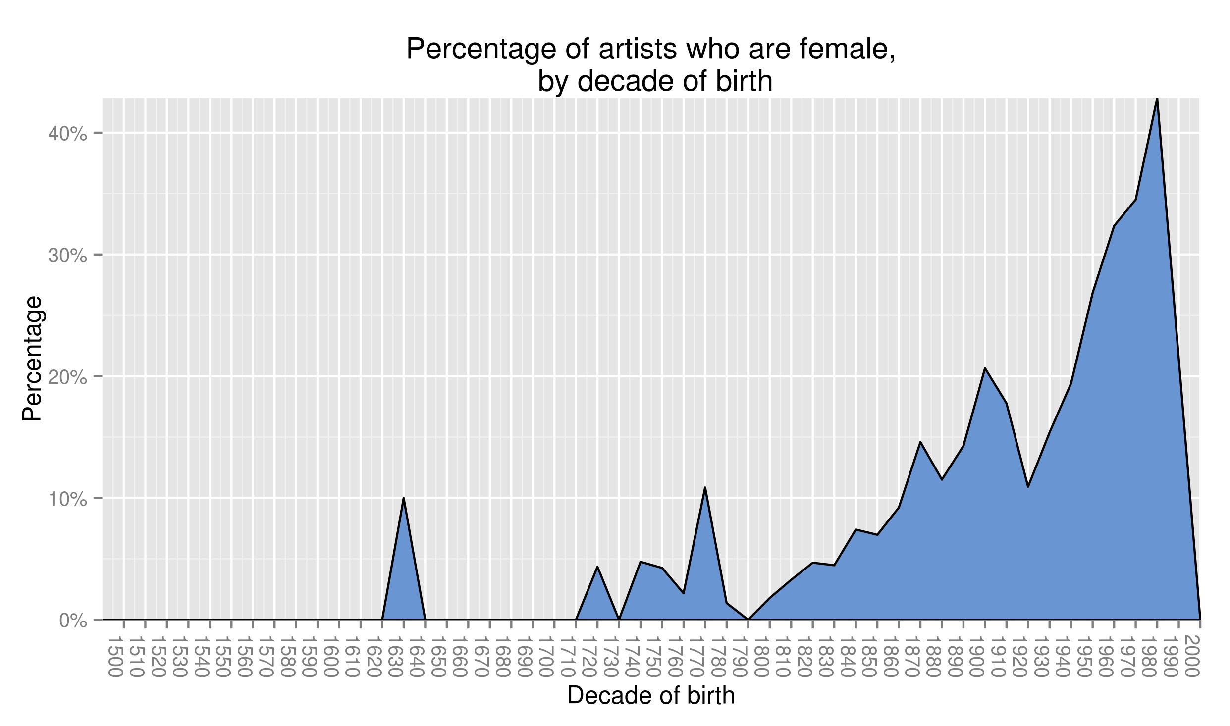
Despite the problems a lot of fields and industries have with gender balance and equal recognition, it looks like the art world (or, at least, the Tate) is doing pretty well. Starting with artists born in the 1930s, representation for women in the gallery began to shoot up, hovering pretty close to 50% for the artists born in the 80s and 90s. Data past that should probably be ignored; 15 year olds tend not to be particularly prolific professional artists.
{<2>}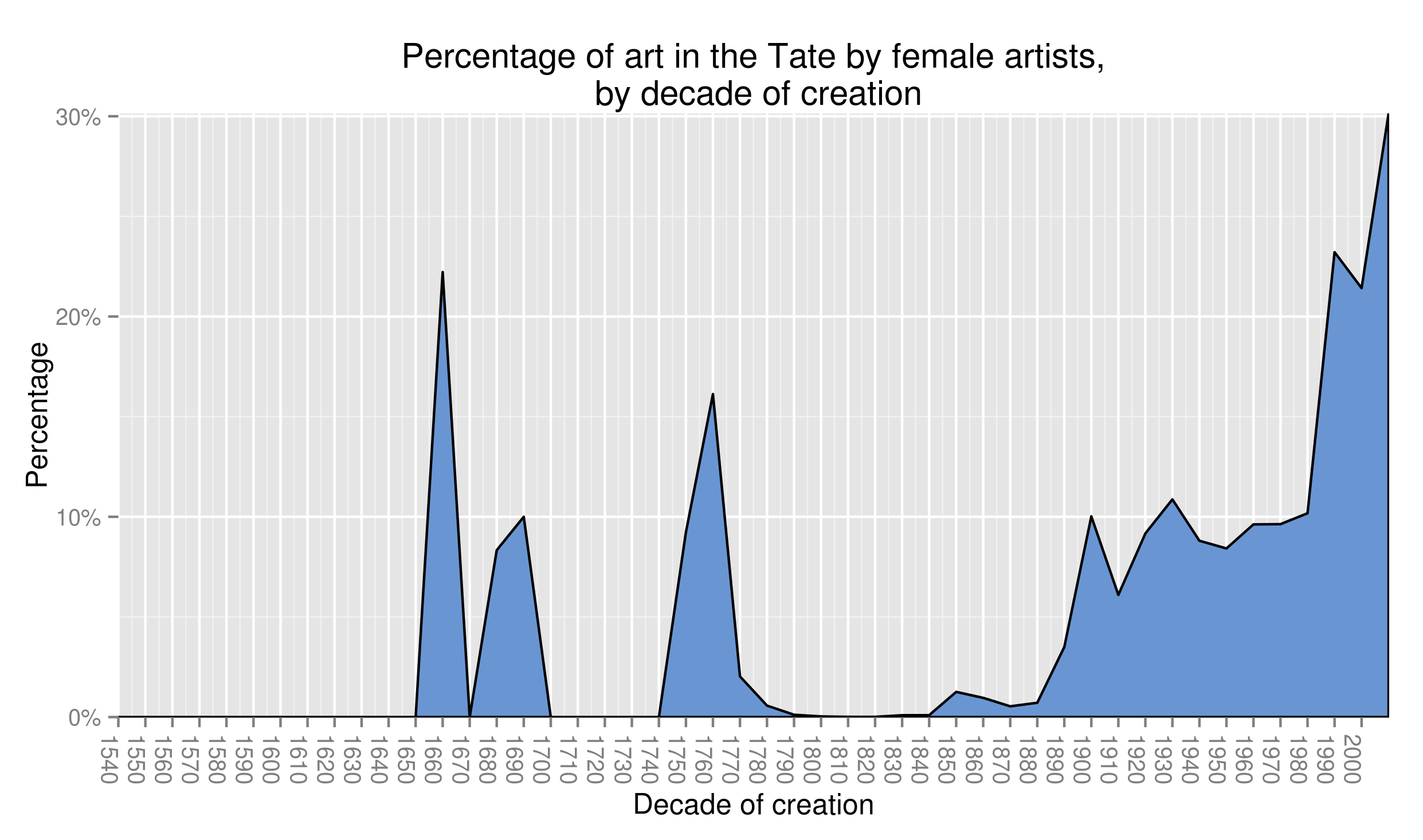
While female and male artists born in the last few decades are almost equally likely to get represented in the Tate, when it comes to the number of works each group has, the data is very different. Only 20-30% of Tate-obtained works produced in the last few decades are by female artists. There are a few possible reasons for this: in order, from least to most likely/interesting:
- Male artists are simply more prolific than female artists;
- The barrier to women being recognised by the Tate is still, despite the first graph, higher than the barrier for men. Male artists’ top, say, 5, works, are accepted - for women, only the best piece they produce is accepted. This would explain why the number of works in the gallery by women is so out-of-sync with the number of women with works in the gallery;
- The female artists born in the 80s and 90s haven’t yet reached their artistic peak. Artists tend to be active for decades, not years; it seems reasonable to expect their output to continue. The numbers we have now represent only the first successes.
Art as space
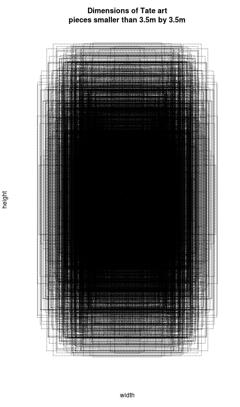
One of the datatypes in the artwork metadata was the dimensions of each piece, in millimetres. I laid them all out as rectangles with dotted borders, and the above graphic is the result. It only covers works where the height and width are both less than 3.5 meters, to avoid falling into a problem with some of the larger pieces where the smaller ones would just display as one big blob.
It’s interesting for a couple of reasons. First, there seem to be some canvas sizes which are pretty uniformly picked. Second, almost all of the works seem to follow the golden ratio when it comes to the relationship between height and width. Third, it’s just damn pretty.
Art as movements Artists don’t work in a vacuum - they share influences, theories and intentions. We tend to group all of this together into “movements” - and the Tate metadata contains information on the perceived movement of individual pieces.
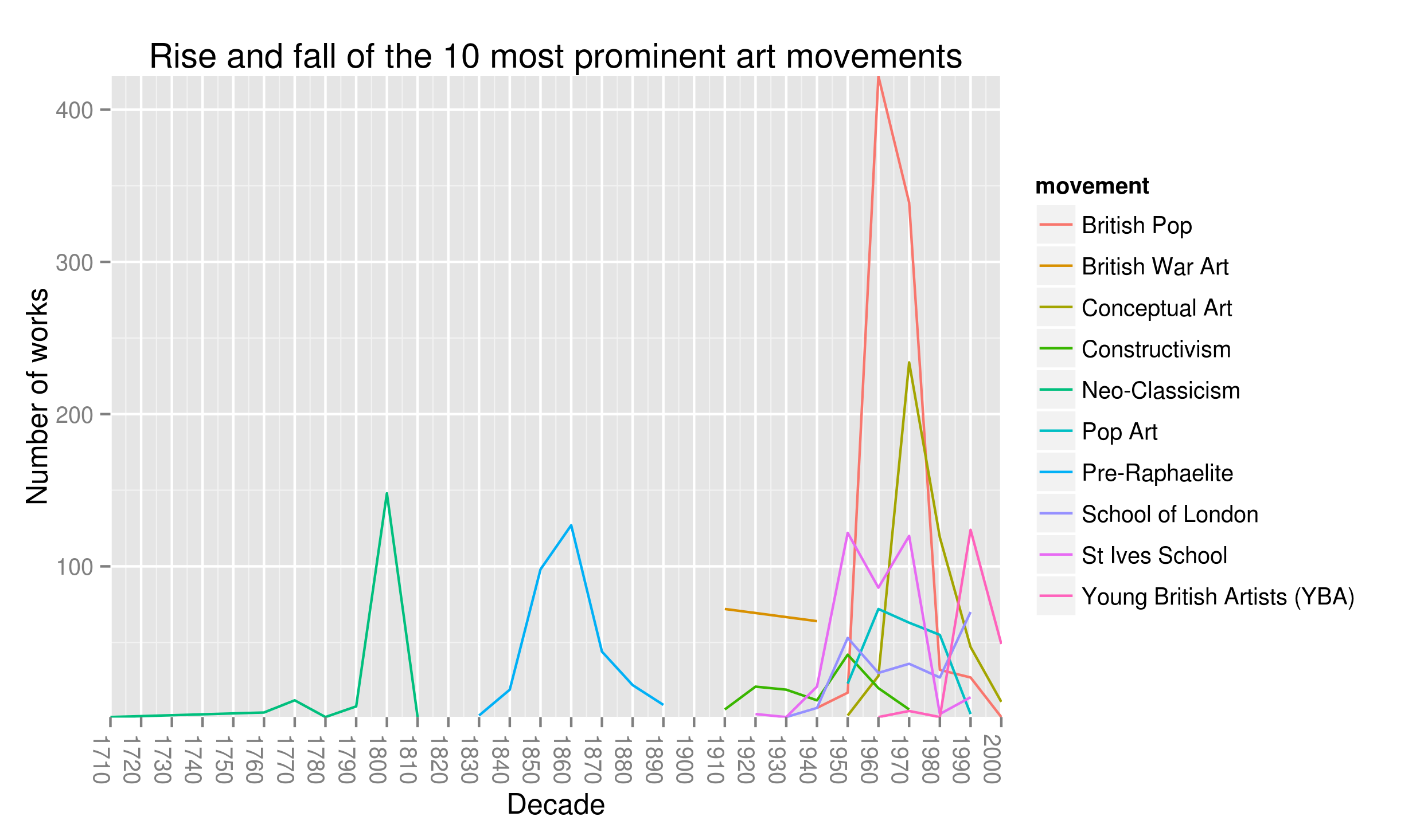
If we take the ten most prominent art movements represented within the Tate collection - defined as those with the greatest number of Tate-owned works associated with them - what we get is eight of them intermingled in the 20th and 21st centuries, rising and dying and rising again within the space of ten or twenty years.
An obvious hypothesis for why this is would be that movements were simply more spotty from the 16th to the 19th centuries; there were a lot of them, but they didn’t each do much and so don’t make the cut.
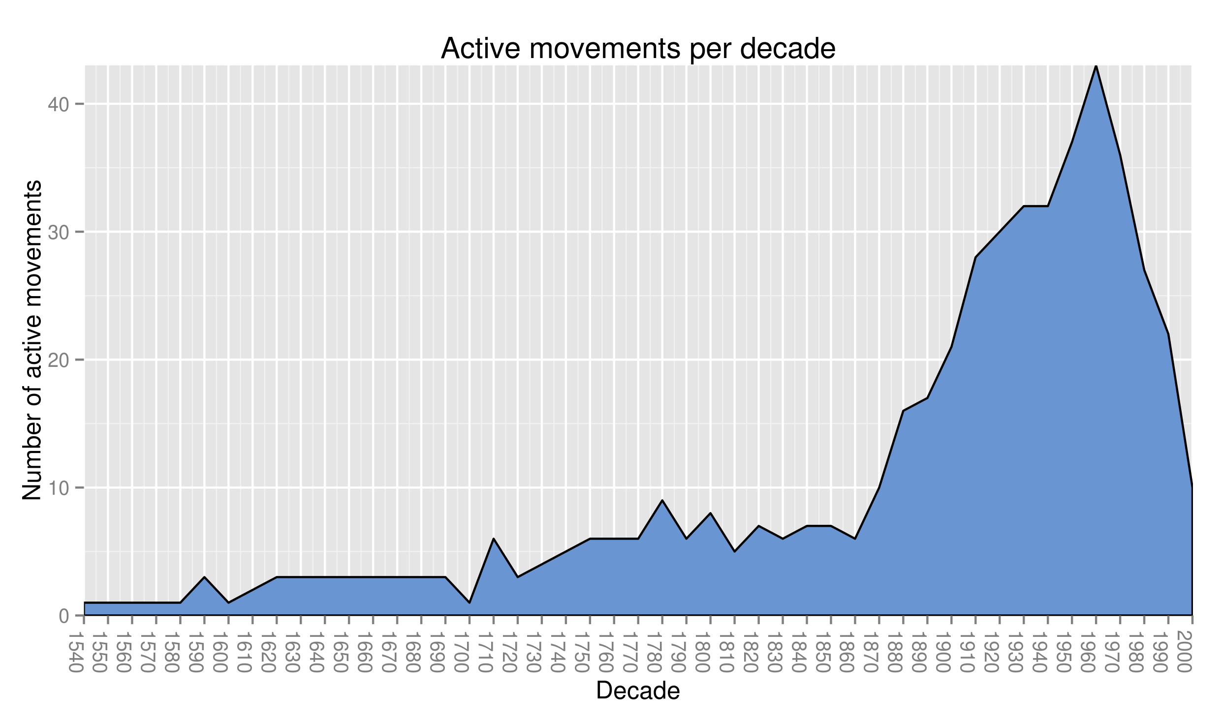
What we actually find is that there were very few movements. Up until the 20th century it was normal to see only two or three active at a time - past that, we peak at 43 distinct artistic motifs in a decade (the 1960s). There are a few things that could explain this; the Tate collection is biased in what it collects, and tends to be more active and more eclectic in modern purchases than it is in historical ones. The modern art movements haven’t yet felt the fell hand of art theorists plucking and prising and debating the validity of their existence, while the Pre-Raphaelites have endured centuries at the mercy of academics merging and amalgamating their ideas. Or maybe the nature of a ‘movement’ has just been devalued.
I’ll be doing some more analysis of this data next weekend, but the stuff so far seems…pretty interesting. Hopefully it’s as fun to read as it was to code - if anyone has suggestions for further things to look at, drop me a note.
Edit: It looks like James Davenport generated the art-as-space visualisation some time ago, albeit at a 3m by 3m scale. Great minds!
Text licensed under the Creative Commons Attribution Share-Alike (CC-BY-SA) 3.0 license. Images dual-licensed under CC-BY-SA 3.0 and the MIT license. Code licensed under the MIT license